Design Foundry
2023 ONGOING
Re-design existing website for a DC-based event design firm to highlight their experiential design and bespoke capabilities.
Project Goal
Visual Design | UX/UI | Front- End Development | Video Editing | Content Curation
RoleFigma | Webflow | After Effects | Photoshop
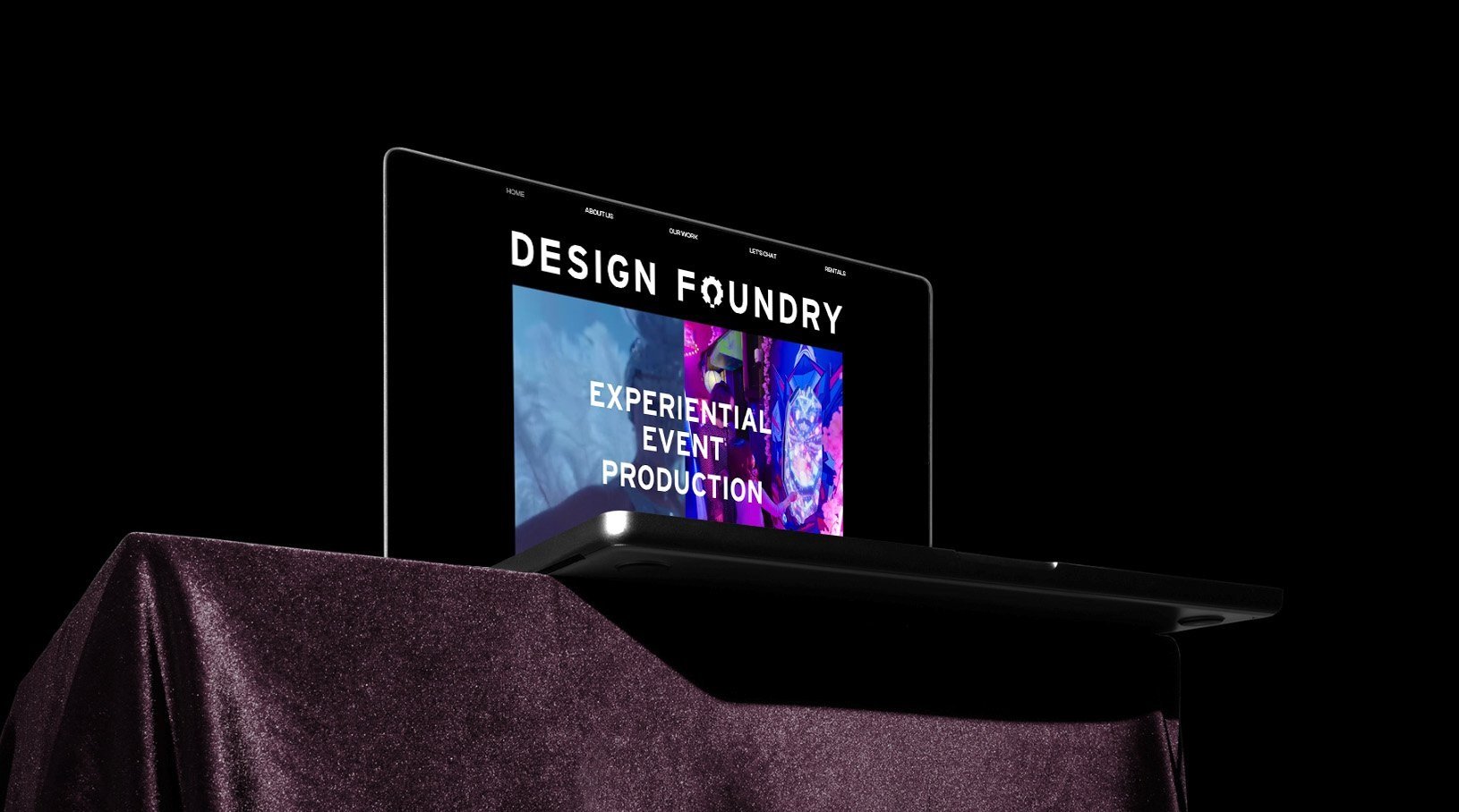
ToolsDesign ChallengeDesign Foundry’s previous website and graphics were playful, busy, multi-colored, and the branding relied heavily on icons/patterns/symbols. My client wanted an updated that was image-forward and more minimal.
Achieved by:
Simplifying the brand’s visual language to let their work speak for itself.
Distinguish Design Foundry from other event companies by highlighting it’s full-service bespoke capacity.
Creating compelling media and content to evoke the experience of being at a live event.
old website


Flat/washed out
Multiple colors and graphics are conflicting in style
Too much text where a picture could tell the story

OLD photo approach
Static imagery, lifeless, and busy.
Composition makes it hard to know where to focus.
Imagery is flat/dimensionless and without context.

ResearchFocus on ways to make Design Foundry an experiential design website vs. a traditional event design portfolio. Their previous site (and most of their local competitors) appear static in the representation of their work. Images should have people, be photographed in compelling ways, and have a creative approach for angles and shots. The goal is to simplify the visual brand and show work in an active, editorial, and compelling way to generate new client relationships.


SolutionSwapping icons and symbols for movement and bold elements throughout the site. Creating videos and gifs evokes the experience and liveliness of attending an event. Scrolling effects and scattered animations throughout the site bring more visual interest to the minimal composition and encourage site exploration.
Old SiteThe white background was made black to add higher contrast and reflect the world of events.
Multi-color graphic elements were removed so the only colors on the page are the photographs.
By removing the extra graphic elements, we create a visual hierarchy.
Too much text on the landing page.
Static imagery was swapped out for videos, gifs, and animations.
New SiteOLD SITe
Initial mockups


Hover-overs are important to make the user feel a reaction to the digital space.
NEW photo approach


Bold imagery with people in action
Fun compositions with editorial lighting
Detail and wide shots to show full-room activation
Compelling shots of design studio and workshop to convey range of capabilities


